The last time I wrote about this app, it worked. I could log a bottle, see my cellar rendered as a stack of racks, ask the AI what to drink, click into a map of Burgundy and see the actual climats. It did everything I set out to build. I ended that post by saying I was still figuring out what to do with it.
This is what I did with it. I took most of it apart.
Not because it was broken. Because it was built for exactly one person — me — and I'd accumulated a lot of fluff along the way without noticing. Every feature I'd added because it seemed useful, every screen I'd built because I could, every filter and toggle and option I'd bolted on over months of evenings. It all worked. It was also, I came to realize, mostly in the way.
The shift happened when I started thinking about letting other people use it.
The brand document
The first thing I did when I started imagining an audience wasn't design work. It was writing down what the app was actually for. A brand document — what it stands for, what it values, what it refuses to be. I'd never done this for a personal project. There was no point; I knew what I meant, because I was the only user.
But the act of writing it down was clarifying in a way I didn't expect. Once I had a clear statement of what the app was supposed to be, I held the existing app up against it. And the app failed its own test almost everywhere. Screens that didn't serve the core idea. Features that existed because they were possible, not because they mattered. Visual noise competing with the things that were actually worth looking at.
It needed close to a complete rebuild. Not because the engineering was wrong — because the app had drifted away from any coherent idea of itself, and I'd never noticed because I was too close to it.
Watching someone else use it
The second thing I did was hand the app to my wife and ask her to use it without any guidance from me.
This is the most uncomfortable and most useful thing you can do with something you've built. I watched her open it and not know where to go. I watched her tap things I thought were obvious and get confused. I watched her miss the features I was proudest of because they were buried, and linger on things I'd considered throwaway. Every hesitation was information. Every "wait, what does this do?" was a screen I'd designed for a version of myself who already knew the answer.
When you build for yourself, you forgive the app everything. You know why the dashboard looks the way it does. You know which filter to reach for. You know that the thing in the corner is important even though nothing tells you so. A stranger knows none of that. The gap between "obvious to me" and "invisible to a newcomer" turned out to be enormous, and I could only see it by watching someone walk into it cold.
What I removed
The redesign, in the end, was mostly subtraction. Addition by subtraction — the cliché is a cliché because it's true. Here's what actually went.
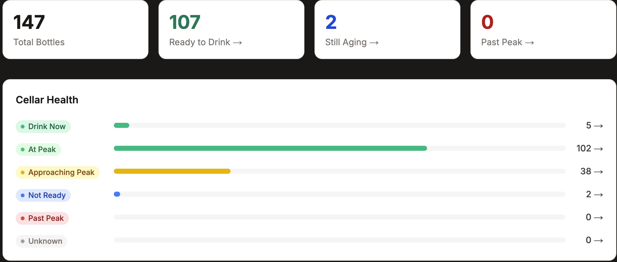
The dashboard. This was the hardest one, because the dashboard had been the landing page — the first thing you saw, positioned as the heart of the app. Total bottles, ready-to-drink counts, cellar health charts, peaking-soon alerts. It looked important. It looked like the center of gravity.
It wasn't. When I was honest about it, the dashboard was performative. It showed numbers that looked meaningful but that I never actually acted on. It was the kind of screen you build because dashboards feel like what serious apps have, not because anyone needs it.
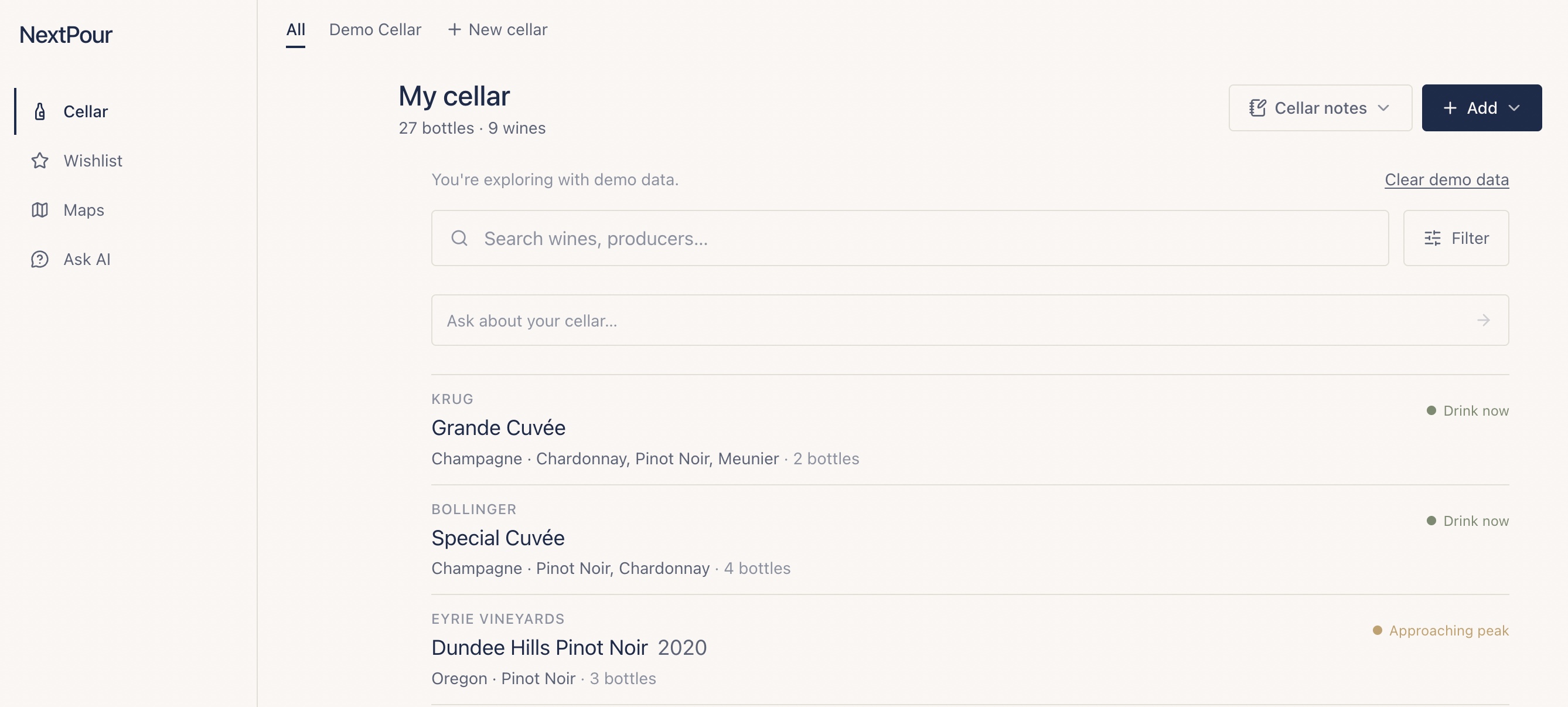
Cutting your own landing page — the thing you'd implicitly told yourself was the core — takes more nerve than I expected. But the app got better the moment it was gone. Here's what the front door looks like now: your wine, grouped by producer, drinkability shown as a quiet word in the margin rather than a chart. A left rail with four things on it. Room to breathe.
The split between Collection and Cellar. I'd built these as two separate things, with their own screens and their own logic. In practice the distinction confused more than it clarified. I consolidated them. One place for your wine, not two overlapping ones.
The filters and the add flow. I'd accumulated filtering options the way you accumulate browser tabs — each one reasonable in the moment, the sum total overwhelming. I cut them down hard. Same with adding a bottle, which had grown into a form with too many fields competing for attention. Drastically simplified. The wine still gets entered; you just aren't asked to think about as much while doing it.
None of these were broken features. That's the part that's worth sitting with. Removing something that doesn't work is easy — it's obvious, and nobody mourns it. Removing something that works, that you built, that you were a little proud of, because it isn't serving the essence — that's the discipline. Every cut was a small argument with myself.
What was left
When the clutter was gone, what remained was simple enough to say in one sentence.
The app is for looking at your wine — and the wine you aspire to — through a map. A map of your cellar, and maps of the wine regions. That's it. That's the essence. Everything that survived the cut serves that idea. Everything that didn't, didn't.
I couldn't have written that sentence before the rebuild. Not because I didn't know it, but because the app was saying too many other things at the same time. Stripping it down was how the core sentence became audible.
What it taught me
Here's the honest part. Normally this is where I'd stop. I get something functioning, it does what I intended, and I move on to the next project. The functional version is the finish line — I've crossed it, time to go find a new thing.
This second pass was different, and it was outside my comfort zone in a way the first build wasn't. Building the thing was exciting. Refining it — designing for users I hadn't met, cutting features I'd been attached to, sweating the details of how a stranger would experience a screen — none of that is my natural mode. I'm a builder by instinct, not a finisher.
But it was more rewarding than the original build. There's a particular satisfaction in taking something that works and making it not just work but feel right — simple and considered and built for someone other than yourself. The first version proved I could make the thing exist. This version was about making it good. I didn't know I'd find that more satisfying. I did.
The app is still mine. But for the first time, it isn't only mine. That turned out to be the whole point.
Built with Claude Code · Spring 2026